Programmingempire
In this article, I will explain how to Visualize Regression Models with Seaborn. To begin with, let us first understand Regression Models.
Regression Models
In order to find the relationship between two variables, we create a regression model. Basically, regression analysis or regression modeling is a predictive modeling technique where we have an independent variable and a dependent variable. The regression analysis tells us that how the dependent variable takes its values according to the independent variable. When we plot the values that the two variables assume, we get a regression line. In other words, we get the best fit line that passes through the plotted data points of two variables such that the distance between the line and the points is minimized.
Seaborn Library of Python
In particular, the Seaborn library offers different plotting functions that work on data frames.
Python Program to Visualize Regression Models with Seaborn
The following python program demonstrates two regression plots. At first, we need to import the seaborn library. After that, we read the dataset file. Further, we remove the rows with missing values using the dropna() function. While the regplot() function plots the regression model. It takes the x, and y variables, and data frame as input. Also, order=2, indicates polynomial regression. Similarly, logistic = true represents logistic regression.
Furthermore, you can download the dataset file stroke_data.csv from here.
import seaborn as sb
from matplotlib import pyplot as plt
import pandas as pd
df1=pd.read_csv("stroke_data.csv")
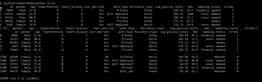
print(df1.head())
print(list(df1))
#Handling Missing values
df2=df1.dropna()
print(df2)
sb.regplot(x="age", y="bmi", data=df2,
order=2, ci=None, scatter=None)
plt.title("Polynomial Regression")
plt.show()
sb.regplot(x="bmi", y="stroke", data=df2,
logistic=True, n_boot=500, y_jitter=.03)
plt.title("Logistic Regression")
plt.show()
Output
Plotting the Polynomial Regression between the bmi and age
In fact, the polynomial regression is a variation of the linear regression where a polynomial of nth degree depicts the relationship between the independent variable and the dependent variable rather than a straight line.
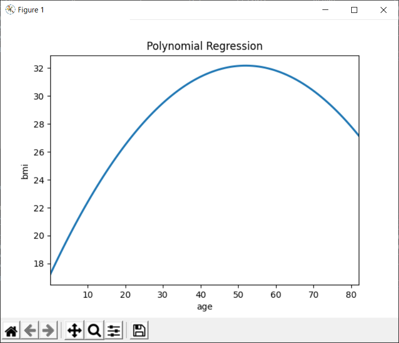
As can be seen in the above figure, BMI (Body Mass Index) increases with the age. However, after reaching its maximum value in the range [40-50], it starts decreasing again. Therefore, we can use a polynomial regression plot to represent this relationship.
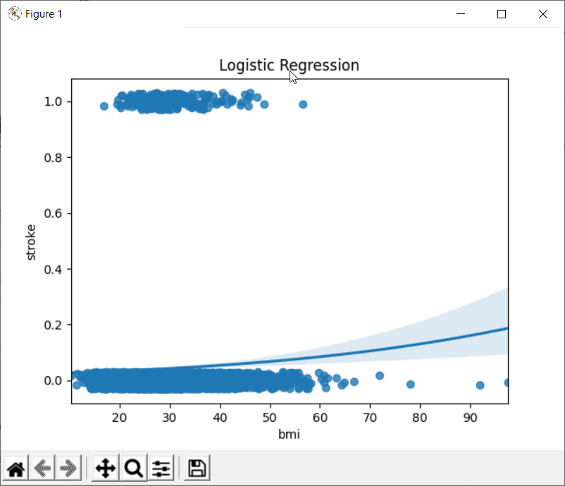
Plotting the Logistic Regression between the stroke and BMI
When we have a dependent variable that takes discrete values, we can use logistic regression. The following figure shows an example of logistic regression. In fact, the variable bmi takes continuous values. While the variable stroke is discrete.
Further Reading
How to Implement Inheritance in Python
Find Prime Numbers in Given Range in Python
Running Instructions in an Interactive Interpreter in Python
Deep Learning Practice Exercise
Deep Learning Methods for Object Detection
Image Contrast Enhancement using Histogram Equalization
Transfer Learning and its Applications
Examples of OpenCV Library in Python
Understanding Blockchain Concepts
Example of Multi-layer Perceptron Classifier in Python
Measuring Performance of Classification using Confusion Matrix
Artificial Neural Network (ANN) Model using Scikit-Learn
Popular Machine Learning Algorithms for Prediction
Long Short Term Memory – An Artificial Recurrent Neural Network Architecture
Python Project Ideas for Undergraduate Students
Creating Basic Charts using Plotly
Visualizing Regression Models with lmplot() and residplot() in Seaborn
Data Visualization with Pandas
A Brief Introduction of Pandas Library in Python
A Brief Tutorial on NumPy in Python
- Angular
- ASP.NET
- C
- C#
- C++
- CSS
- Dot Net Framework
- HTML
- IoT
- Java
- JavaScript
- Kotlin
- PHP
- Power Bi
- Python
- Scratch 3.0
- TypeScript
- VB.NET