Programmingempire
In this article on Understanding Grids in Bootstrap, I will explain how the grid system of bootstrap works. Basically, the grid system represents a 12 column layout. It is fully responsive. Furthermore, the grid system makes use of the flexbox.
Hence, with the bootstrap grid system, you can design your web page using any layout. Either you can use all of these 12 columns. However, you can also merge them in order to have wider columns.
Examples for Understanding Grids in Bootstrap
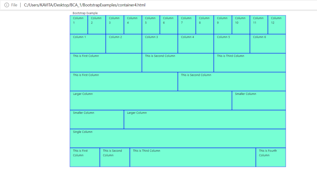
So, the grid system uses rows, columns, and containers. While you can create columns of any size. However, the combined size of columns must be equal to 12. The following example code helps in Understanding Grids in Bootstrap.
<html>
  <head>
    <title>Bootstrap Example</title>
<link rel="stylesheet" href="https://maxcdn.bootstrapcdn.com/bootstrap/4.0.0/css/bootstrap.min.css" integrity="sha384-Gn5384xqQ1aoWXA+058RXPxPg6fy4IWvTNh0E263XmFcJlSAwiGgFAW/dAiS6JXm" crossorigin="anonymous">
<script src="https://code.jquery.com/jquery-3.2.1.slim.min.js" integrity="sha384-KJ3o2DKtIkvYIK3UENzmM7KCkRr/rE9/Qpg6aAZGJwFDMVNA/GpGFF93hXpG5KkN" crossorigin="anonymous"></script>
<script src="https://cdnjs.cloudflare.com/ajax/libs/popper.js/1.12.9/umd/popper.min.js" integrity="sha384-ApNbgh9B+Y1QKtv3Rn7W3mgPxhU9K/ScQsAP7hUibX39j7fakFPskvXusvfa0b4Q" crossorigin="anonymous"></script>
<script src="https://maxcdn.bootstrapcdn.com/bootstrap/4.0.0/js/bootstrap.min.js" integrity="sha384-JZR6Spejh4U02d8jOt6vLEHfe/JQGiRRSQQxSfFWpi1MquVdAyjUar5+76PVCmYl" crossorigin="anonymous"></script>

  <style>
    .mydiv{
        background: #77FFD4;
        height: 670px;
        text-align: center;
        font-size: 30px;
     }
     .myrow1{
        background: #77FFD4; height: 100px;}
     .mycol{
        border: 2px solid #0000ff;
      }

  </style>
  </head>
  <body>
    <div class="container">
        Bootstrap Example
        <div class="row myrow1">
          <div class="col mycol">Column 1</div>
          <div class="col mycol">Column 2</div>
          <div class="col mycol">Column 3</div>
          <div class="col mycol">Column 4</div>
          <div class="col mycol">Column 5</div>
          <div class="col mycol">Column 6</div>
          <div class="col mycol">Column 7</div>
          <div class="col mycol">Column 8</div>
          <div class="col mycol">Column 9</div>
          <div class="col mycol">Column 10</div>
          <div class="col mycol">Column 11</div>
          <div class="col mycol">Column 12</div>
        </div>
        <div class="row myrow1">
          <div class="col mycol">Column 1</div>
          <div class="col mycol">Column 2</div>
          <div class="col mycol">Column 3</div>
          <div class="col mycol">Column 4</div>
          <div class="col mycol">Column 5</div>
          <div class="col mycol">Column 6</div>
        </div>
        <div class="row myrow1">
          <div class="col mycol">This is First Column</div>
          <div class="col mycol">This is Second Column</div>
          <div class="col mycol">This is Third Column</div>
        </div>
        <div class="row myrow1">
          <div class="col mycol">This is First Column</div>
          <div class="col mycol">This is Second Column</div>
        </div>
        <div class="row myrow1">
          <div class="col-9 mycol">Larger Column</div>
          <div class="col-3 mycol">Smaller Column</div>
        </div>
        <div class="row myrow1">
          <div class="col-3 mycol">Smaller Column</div>
          <div class="col-9 mycol">Larger Column</div>
        </div>
        <div class="row myrow1">
          <div class="col mycol">Single Column</div>
        </div>
        <div class="row myrow1">
          <div class="col mycol">This is First Column</div>
          <div class="col mycol">This is Second Column</div>
          <div class="col-md-7 mycol">This is Third Column</div>
          <div class="col mycol">This is Fourth Column</div>
        </div>

    </div>
  </body>
</html>
Output
Classes for Columns in Bootstrap Grid System
The following classes are there in the grid system.
- .col. This class creates equal width columns.
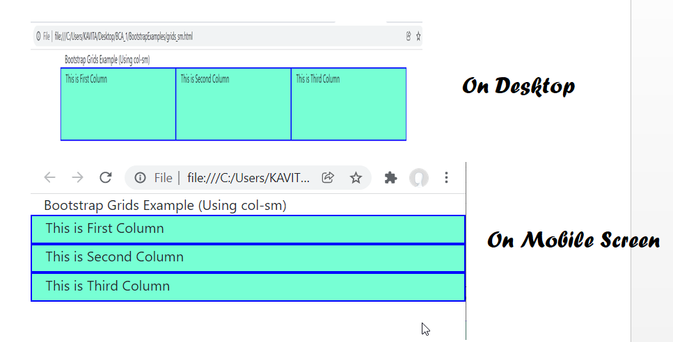
- .col-sm. In order to create 100% width columns on small devices we use col-sm. In other words, for screen size (<=768px) full width columns are displayed.
- .col-md. It represents columns with medium-device screen width.
- .col-lg. It represents columns with large-device screen width.
- .col-xl. It represents columns with extra-large device screen width.
The following example illustrates how we use the above classes on a web page.
<html>
  <head>
    <title>Bootstrap Example</title>
<link rel="stylesheet" href="https://maxcdn.bootstrapcdn.com/bootstrap/4.0.0/css/bootstrap.min.css" integrity="sha384-Gn5384xqQ1aoWXA+058RXPxPg6fy4IWvTNh0E263XmFcJlSAwiGgFAW/dAiS6JXm" crossorigin="anonymous">
<script src="https://code.jquery.com/jquery-3.2.1.slim.min.js" integrity="sha384-KJ3o2DKtIkvYIK3UENzmM7KCkRr/rE9/Qpg6aAZGJwFDMVNA/GpGFF93hXpG5KkN" crossorigin="anonymous"></script>
<script src="https://cdnjs.cloudflare.com/ajax/libs/popper.js/1.12.9/umd/popper.min.js" integrity="sha384-ApNbgh9B+Y1QKtv3Rn7W3mgPxhU9K/ScQsAP7hUibX39j7fakFPskvXusvfa0b4Q" crossorigin="anonymous"></script>
<script src="https://maxcdn.bootstrapcdn.com/bootstrap/4.0.0/js/bootstrap.min.js" integrity="sha384-JZR6Spejh4U02d8jOt6vLEHfe/JQGiRRSQQxSfFWpi1MquVdAyjUar5+76PVCmYl" crossorigin="anonymous"></script>

  <style>
    .mydiv{
        background: #77FFD4;
        height: 670px;
        text-align: center;
        font-size: 30px;
     }
     .myrow1{
        background: #77FFD4; height: 100px;}
     .mycol{
        border: 2px solid #0000ff;
      }

  </style>
  </head>
  <body>
    <div class="container">
        Bootstrap Grids Example (Using col-sm)

        <div class="row myrow1">
          <div class="col-sm mycol">This is First Column</div>
          <div class="col-sm mycol">This is Second Column</div>
          <div class="col-sm mycol">This is Third Column</div>
        </div>
    </div>
  </body>
</html>
Output
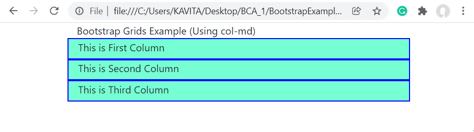
Similarly, by replacing col-sm with col-md in the above example, we get full-width columns on medium and small screen devices. The following output shows it.
Likewise, for full-width columns on large screen devices, we use col-lg. In a similar way, we can use col-xl for extra-large screens.
We can also have variable width columns. In order to create variable-width columns, we use .col-{breakpoint}-auto class. For instance, .col-md-auto creates a variable width column on medium size device.
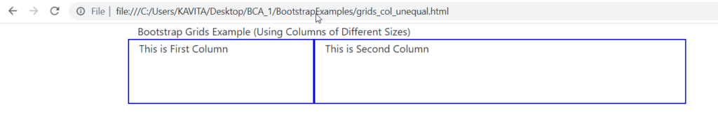
In case, the combined size of all columns in a row exceeds 12, the remaining columns will be displayed in the next row. For instance suppose, we use three columns with classes .col-4, .col-6, and .col-5. In this case, the third column takes the next row. Furthermore, if the total size of all columns is less than or equal to 12 but the columns have margin, padding, and border. So, the columns may not fit in a single row. Therefore, they occupy the next row. The following example demonstrates it.
<html>
  <head>
    <title>Bootstrap Example</title>
<link rel="stylesheet" href="https://maxcdn.bootstrapcdn.com/bootstrap/4.0.0/css/bootstrap.min.css" integrity="sha384-Gn5384xqQ1aoWXA+058RXPxPg6fy4IWvTNh0E263XmFcJlSAwiGgFAW/dAiS6JXm" crossorigin="anonymous">
<script src="https://code.jquery.com/jquery-3.2.1.slim.min.js" integrity="sha384-KJ3o2DKtIkvYIK3UENzmM7KCkRr/rE9/Qpg6aAZGJwFDMVNA/GpGFF93hXpG5KkN" crossorigin="anonymous"></script>
<script src="https://cdnjs.cloudflare.com/ajax/libs/popper.js/1.12.9/umd/popper.min.js" integrity="sha384-ApNbgh9B+Y1QKtv3Rn7W3mgPxhU9K/ScQsAP7hUibX39j7fakFPskvXusvfa0b4Q" crossorigin="anonymous"></script>
<script src="https://maxcdn.bootstrapcdn.com/bootstrap/4.0.0/js/bootstrap.min.js" integrity="sha384-JZR6Spejh4U02d8jOt6vLEHfe/JQGiRRSQQxSfFWpi1MquVdAyjUar5+76PVCmYl" crossorigin="anonymous"></script>

  <style>
    .mydiv{

        height: 670px;
        text-align: center;
        font-size: 30px;
     }
     .myrow1{
        height: 100px;}
     .mycol{
        border: 2px solid #0000ff;
      }

  </style>
  </head>
  <body>
    <div class="container">
        Bootstrap Grids Example (Using Columns of Different Sizes)

        <div class="row myrow1">
          <div class="col-md-3 mycol">This is First Column</div>
          <div class="col-md-6 mycol">This is Second Column</div>
         </div>
    </div>
  </body>
</html>
Output
Further Reading
Example of Column Properties in CSS
Examples of Outline Properties in CSS
Examples of Display and Position Properties in CSS
- AI
- Android
- Angular
- ASP.NET
- Augmented Reality
- AWS
- Bioinformatics
- Biometrics
- Blockchain
- Bootstrap
- C
- C#
- C++
- Cloud Computing
- Competitions
- Courses
- CSS
- Cyber Security
- Data Science
- Data Structures and Algorithms
- Data Visualization
- Datafication
- Deep Learning
- DevOps
- Digital Forensic
- Digital Trust
- Digital Twins
- Django
- Docker
- Dot Net Framework
- Drones
- Elasticsearch
- ES6
- Extended Reality
- Flutter and Dart
- Full Stack Development
- Git
- Go
- HTML
- Image Processing
- IoT
- IT
- Java
- JavaScript
- Kotlin
- Latex
- Machine Learning
- MEAN Stack
- MERN Stack
- Microservices
- MongoDB
- NodeJS
- PHP
- Power Bi
- Projects
- Python
- Quantum Computing
- React
- Robotics
- Rust
- Scratch 3.0
- Shell Script
- Smart City
- Software
- Solidity
- SQL
- SQLite
- Tecgnology
- Tkinter
- TypeScript
- VB.NET
- Virtual Reality
- Web Designing
- WebAssembly
- XML