Programmingempire
In this article, I will explain Container Class in Bootstrap. Basically, we use containers to create the layout of a web page. In Bootstrap, containers are the most fundamental elements for creating layout. While, the containers enclose rows of elements. Further, rows may contain columns.
We have different container classes in Bootstrap 4. The following list describes these classes.
- .container. Basically, it is the responsive container. So, at each break point it sets the max-width of that break point. For instance, if the break-point is 540px, it sets the max-width to 540px. Further, it is the fixed-width container.
- .container-fluid. Whenever we need a full width ccontainer, we use this type of container. In other words, for each breakpoint, width is always 100%.
Apart from above containers, Bootstrap 4 has other containers. These containers are specific to a breakpoint. For instance, in case of .container-sm, width remains 100% for extra small screens which are less than 576px. Further, for small screens (more than 576 px), width is 540 px. Similarly, for medium screens, the width is 720px, for large screen, it is 960px, and for extra large, the width is 1140px.
Likewise, .container-xl sets the width to 1140px for extra large screens. However, for all smaller screens, the width remains 100%. Similarly, we can also use .container-md and .container-lg. All these containers set width to 100% till the specific breakpoint is reached.
Examples of Container Class in Bootstrap
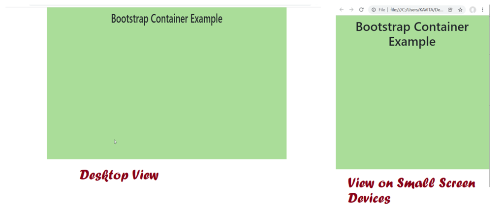
The following example demonstrates the use of container class.
<html>
 <head>
    <title>Container Class Example</title>
    <link rel="stylesheet" href="https://cdn.jsdelivr.net/npm/bootstrap@4.6.1/dist/css/bootstrap.min.css" integrity="sha384-zCbKRCUGaJDkqS1kPbPd7TveP5iyJE0EjAuZQTgFLD2ylzuqKfdKlfG/eSrtxUkn" crossorigin="anonymous">
    <script src="https://cdn.jsdelivr.net/npm/jquery@3.5.1/dist/jquery.slim.min.js" integrity="sha384-DfXdz2htPH0lsSSs5nCTpuj/zy4C+OGpamoFVy38MVBnE+IbbVYUew+OrCXaRkfj" crossorigin="anonymous"></script>
    <script src="https://cdn.jsdelivr.net/npm/bootstrap@4.6.1/dist/js/bootstrap.bundle.min.js" integrity="sha384-fQybjgWLrvvRgtW6bFlB7jaZrFsaBXjsOMm/tB9LTS58ONXgqbR9W8oWht/amnpF" crossorigin="anonymous"></script>
    <style>
	.mydiv{
	   height: 500px;
           padding: 10px;
	}
    </style>
 </head>
 <body>
   <div class="container mydiv" style="background: #aadd99">
       <h1 class="text-center">Bootstrap Container Example</h1>
   </div>
 </body>
</html>
Output
More Examples of Container Class in Bootstrap
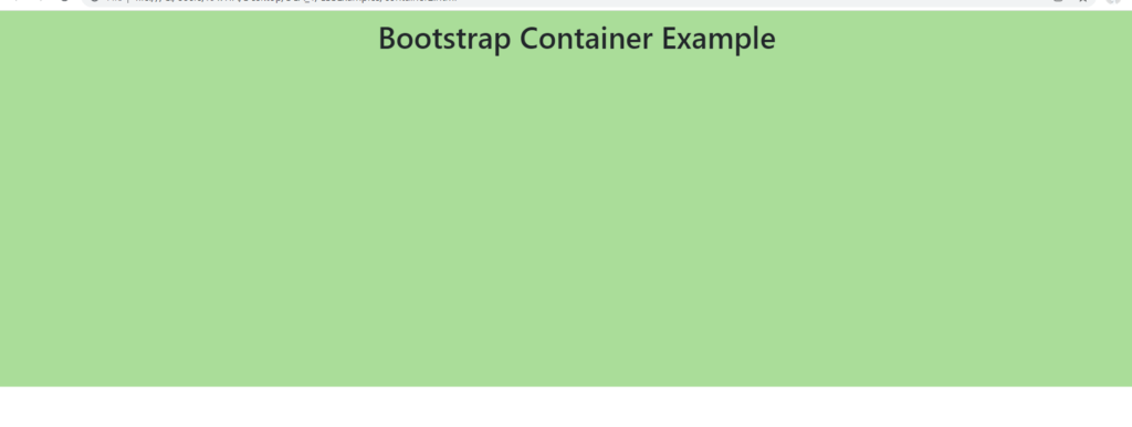
The following code demonstrates a full width container using container-fluid class.
<html>
 <head>
    <title>Container Class Example</title>
    <link rel="stylesheet" href="https://cdn.jsdelivr.net/npm/bootstrap@4.6.1/dist/css/bootstrap.min.css" integrity="sha384-zCbKRCUGaJDkqS1kPbPd7TveP5iyJE0EjAuZQTgFLD2ylzuqKfdKlfG/eSrtxUkn" crossorigin="anonymous">
    <script src="https://cdn.jsdelivr.net/npm/jquery@3.5.1/dist/jquery.slim.min.js" integrity="sha384-DfXdz2htPH0lsSSs5nCTpuj/zy4C+OGpamoFVy38MVBnE+IbbVYUew+OrCXaRkfj" crossorigin="anonymous"></script>
    <script src="https://cdn.jsdelivr.net/npm/bootstrap@4.6.1/dist/js/bootstrap.bundle.min.js" integrity="sha384-fQybjgWLrvvRgtW6bFlB7jaZrFsaBXjsOMm/tB9LTS58ONXgqbR9W8oWht/amnpF" crossorigin="anonymous"></script>
    <style>
	.mydiv{
	   height: 500px;
           padding: 10px;
	}
    </style>
 </head>
 <body>
   <div class="container-fluid mydiv" style="background: #aadd99">
       <h1 class="text-center">Bootstrap Container Example</h1>
   </div>
 </body>
</html>
Output
Further Reading
Example of Column Properties in CSS
Examples of Outline Properties in CSS
Examples of Display and Position Properties in CSS
- AI
- Android
- Angular
- ASP.NET
- Augmented Reality
- AWS
- Bioinformatics
- Biometrics
- Blockchain
- Bootstrap
- C
- C#
- C++
- Cloud Computing
- Competitions
- Courses
- CSS
- Cyber Security
- Data Science
- Data Structures and Algorithms
- Data Visualization
- Datafication
- Deep Learning
- DevOps
- Digital Forensic
- Digital Trust
- Digital Twins
- Django
- Docker
- Dot Net Framework
- Drones
- Elasticsearch
- ES6
- Extended Reality
- Flutter and Dart
- Full Stack Development
- Git
- Go
- HTML
- Image Processing
- IoT
- IT
- Java
- JavaScript
- Kotlin
- Latex
- Machine Learning
- MEAN Stack
- MERN Stack
- Microservices
- MongoDB
- NodeJS
- PHP
- Power Bi
- Projects
- Python
- Quantum Computing
- React
- Robotics
- Rust
- Scratch 3.0
- Shell Script
- Smart City
- Software
- Solidity
- SQL
- SQLite
- Tecgnology
- Tkinter
- TypeScript
- VB.NET
- Virtual Reality
- Web Designing
- WebAssembly
- XML