This blog provides few Basic Programs on Data Visualization.
Brief Overview of Basic Programs on Data Visualization
In this collection of basic data visualization programs, we explore examples using popular JavaScript and Python libraries. These programs serve as fundamental building blocks for creating various visualizations, ranging from simple bar charts and line graphs to more complex scatter plots, pie charts, and heatmaps. The JavaScript examples leverage D3.js, Chart.js, Plotly, and Highcharts, demonstrating the diversity of libraries available for web-based data visualization. On the Python side, the programs utilize Matplotlib, Seaborn, and Plotly Express, showcasing the flexibility and ease of use in creating visualizations within the Python ecosystem. These examples are designed to help beginners grasp the foundational concepts and syntax required to visualize data effectively.
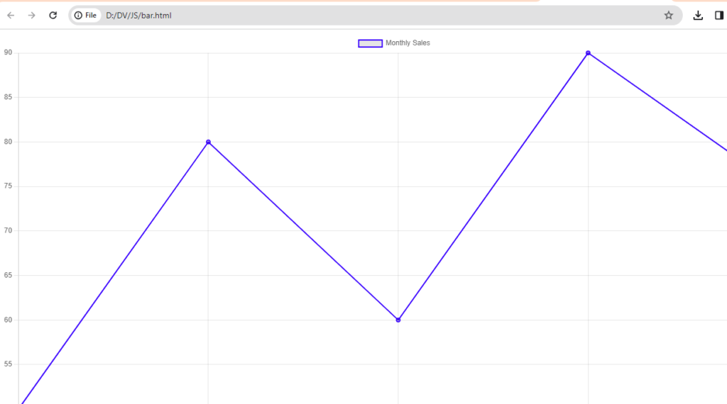
Line Chart with Chart.js
- Chart.js is a simple yet flexible JavaScript charting library. This example demonstrates a basic line chart.
<!-- index.html -->
<!DOCTYPE html>
<html lang="en">
<head>
  <meta charset="UTF-8">
  <title>Line Chart with Chart.js</title>
  <script src="https://cdn.jsdelivr.net/npm/chart.js"></script>
</head>
<body>
  <canvas id="myLineChart" width="400" height="200"></canvas>
  <script>
    const ctx = document.getElementById('myLineChart').getContext('2d');
    const data = {
      labels: ['January', 'February', 'March', 'April', 'May'],
      datasets: [{
        label: 'Monthly Sales',
        data: [50, 80, 60, 90, 75],
        borderColor: 'blue',
        borderWidth: 2,
      }]
    };

    new Chart(ctx, {
      type: 'line',
      data: data,
    });
  </script>
</body>
</html>
Output
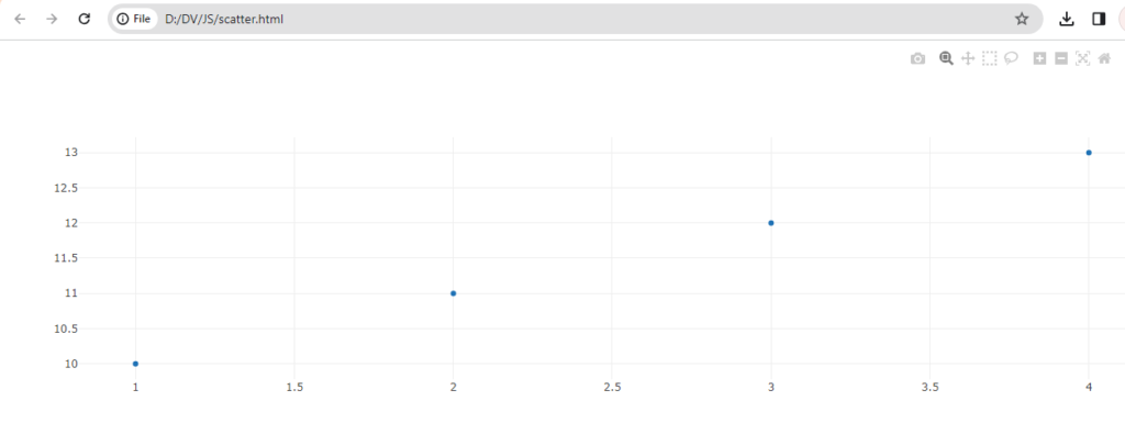
Scatter Plot with Plotly
- Plotly is a versatile JavaScript graphing library. This example creates a basic scatter plot.
<!-- index.html -->
<!DOCTYPE html>
<html lang="en">
<head>
  <meta charset="UTF-8">
  <title>Scatter Plot with Plotly</title>
  <script src="https://cdn.plot.ly/plotly-latest.min.js"></script>
</head>
<body>
  <div id="myScatterPlot"></div>
  <script>
    const data = [{
      x: [1, 2, 3, 4],
      y: [10, 11, 12, 13],
      mode: 'markers',
      type: 'scatter'
    }];

    Plotly.newPlot('myScatterPlot', data);
  </script>
</body>
</html>
Output
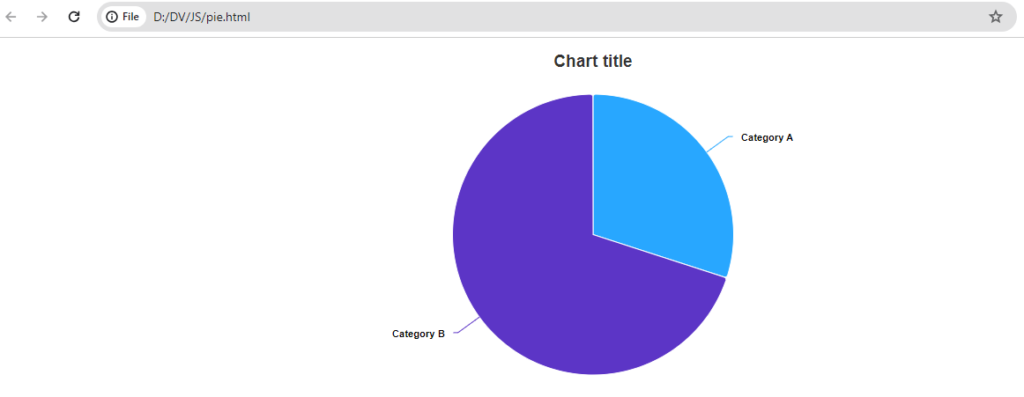
Pie Chart with Highcharts
- Highcharts is a popular JavaScript charting library. This example creates a simple pie chart.
<!-- index.html -->
<!DOCTYPE html>
<html lang="en">
<head>
  <meta charset="UTF-8">
  <title>Pie Chart with Highcharts</title>
  <script src="https://code.highcharts.com/highcharts.js"></script>
</head>
<body>
  <div id="myPieChart"></div>
  <script>
    const data = {
      chart: {
        type: 'pie'
      },
      series: [{
        name: 'Categories',
        data: [{
          name: 'Category A',
          y: 30
        }, {
          name: 'Category B',
          y: 70
        }]
      }]
    };

    Highcharts.chart('myPieChart', data);
  </script>
</body>
</html>
Output
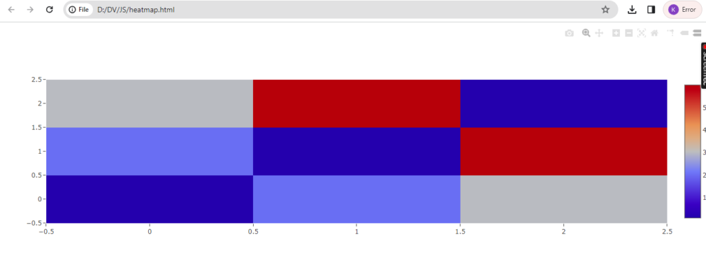
Heatmap with Plotly.js
- Another example using Plotly, this time for a basic heatmap.
<!-- index.html -->
<!DOCTYPE html>
<html lang="en">
<head>
  <meta charset="UTF-8">
  <title>Heatmap with Plotly.js</title>
  <script src="https://cdn.plot.ly/plotly-latest.min.js"></script>
</head>
<body>
  <div id="myHeatmap"></div>
  <script>
    const data = [{
      z: [
        [1, 20, 30],
        [20, 1, 60],
        [30, 60, 1]
      ],
      type: 'heatmap'
    }];

    Plotly.newPlot('myHeatmap', data);
  </script>
</body>
</html>
Output
Python has several libraries for data visualization. Here are a few examples using Matplotlib and Seaborn, two popular Python libraries for creating static visualizations:
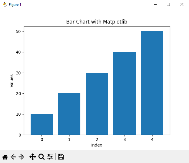
Bar Chart with Matplotlib
- Matplotlib is a widely used plotting library in Python. This example creates a basic bar chart.
import matplotlib.pyplot as plt

data = [10, 20, 30, 40, 50]

plt.bar(range(len(data)), data)
plt.xlabel('Index')
plt.ylabel('Values')
plt.title('Bar Chart with Matplotlib')
plt.show()
Output
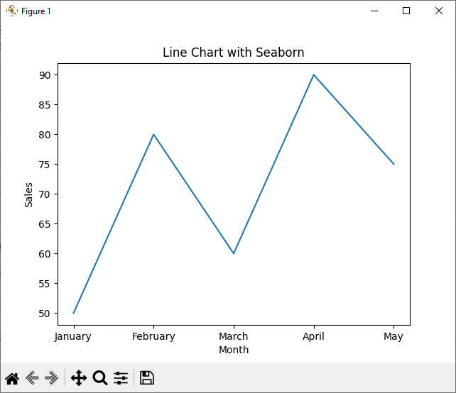
Line Chart with Seaborn
- Seaborn is built on top of Matplotlib and provides a high-level interface for drawing attractive statistical graphics. This example demonstrates a basic line chart.
import seaborn as sns
import matplotlib.pyplot as plt
import pandas as pd

data = {'Month': ['January', 'February', 'March', 'April', 'May'],
        'Sales': [50, 80, 60, 90, 75]}

df = pd.DataFrame(data)

sns.lineplot(x='Month', y='Sales', data=df)
plt.title('Line Chart with Seaborn')
plt.show()
Output
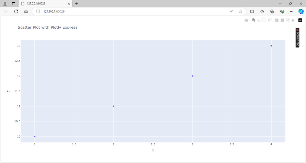
Scatter Plot with Plotly Express
- Plotly Express is a high-level interface for creating various types of visualizations. This example creates a scatter plot.
import plotly.express as px

data = {'x': [1, 2, 3, 4], 'y': [10, 11, 12, 13]}

fig = px.scatter(data, x='x', y='y', title='Scatter Plot with Plotly Express')
fig.show()
Output
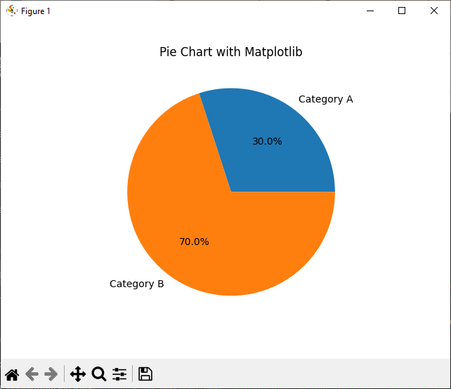
Pie Chart with Matplotlib
- A simple example of a pie chart using Matplotlib.
import matplotlib.pyplot as plt

labels = ['Category A', 'Category B']
sizes = [30, 70]

plt.pie(sizes, labels=labels, autopct='%1.1f%%')
plt.title('Pie Chart with Matplotlib')
plt.show()
Output
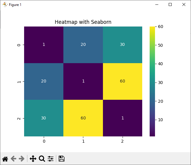
Heatmap with Seaborn
- Seaborn can be used to create heatmaps easily.
import seaborn as sns
import matplotlib.pyplot as plt

data = [[1, 20, 30], [20, 1, 60], [30, 60, 1]]

sns.heatmap(data, annot=True, cmap='viridis')
plt.title('Heatmap with Seaborn')
plt.show()
Output
Make sure to install the required libraries (matplotlib, seaborn, plotly) before running these examples. You can use the following commands to install them:
pip install matplotlib seaborn plotly
Summary
n summary, the provided examples cover a spectrum of data visualization techniques using both JavaScript and Python. The JavaScript programs showcase the capabilities of libraries like D3.js for dynamic and interactive visualizations, Chart.js for straightforward charts, and Plotly for versatile plotting. On the Python side, Matplotlib and Seaborn offer a solid foundation for creating static visualizations, while Plotly Express simplifies the process of generating interactive plots. Whether you’re working in a web development environment or a data science setting, these basic programs lay the groundwork for more advanced and sophisticated data visualizations.
Further Reading
Examples of OpenCV Library in Python
A Brief Introduction of Pandas Library in Python
A Brief Tutorial on NumPy in Python
- Angular
- ASP.NET
- C
- C#
- C++
- CSS
- Dot Net Framework
- HTML
- IoT
- Java
- JavaScript
- Kotlin
- PHP
- Power Bi
- Python
- Scratch 3.0
- TypeScript
- VB.NET