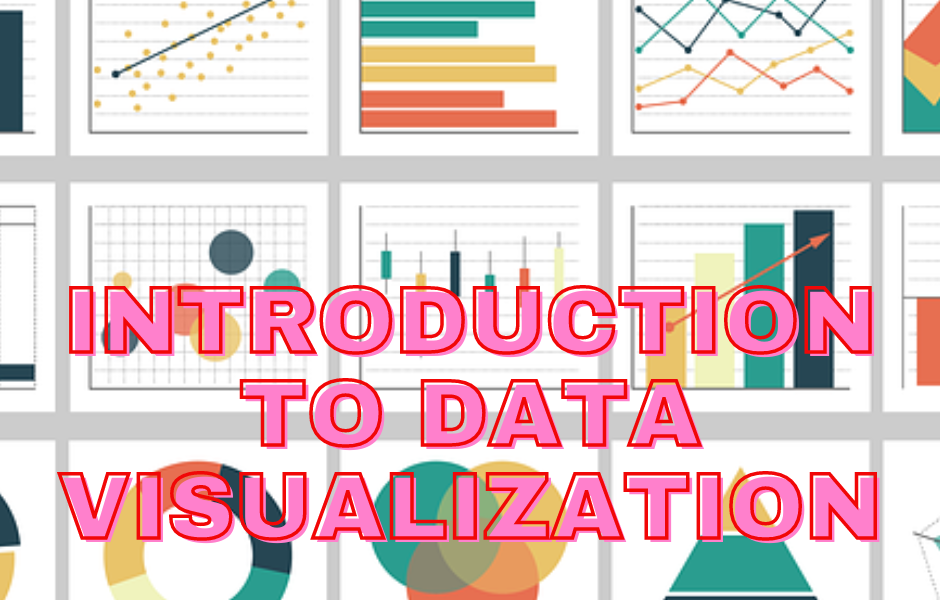
This blog provides a brief Introduction to Data Visualization.

Data visualization is the representation of data in graphical or visual format. It involves creating visual elements like charts, graphs, and maps to help people understand and interpret data more effectively. The primary goal of data visualization is to communicate complex information in a clear, concise, and visually appealing manner, making it easier for individuals to identify patterns, trends, and insights.
A Brief Introduction to Data Visualization
Key components of data visualization include
- Data: The raw information or numbers that you want to represent visually. This could include anything from sales figures and survey responses to temperature measurements and demographic data.
- Visual Elements: These are the graphical representations used to convey the data. Common examples include bar charts, line graphs, pie charts, scatter plots, heatmaps, and more. The choice of visual elements depends on the nature of the data and the insights you want to convey.
- Visualization Tools: Software or tools that facilitate the creation of visualizations. There are various tools available, ranging from simple spreadsheet applications with built-in charting features to more advanced tools like Tableau, Power BI, and Python libraries like Matplotlib and Seaborn.
- Design Principles: Effective data visualization is not just about throwing numbers onto a chart; it involves adhering to design principles to ensure clarity and interpretability. Key design principles include choosing appropriate chart types, using colors effectively, providing clear labels and titles, and avoiding unnecessary clutter.
- Interactivity: Some visualizations include interactive elements that allow users to explore the data further. This could involve hovering over data points to see specific values, zooming in on certain areas of a chart, or filtering data dynamically.
Benefits of Data Visualization
- Enhances Understanding: Visualizations make it easier to grasp complex data patterns and relationships compared to raw numbers or textual descriptions.
- Identifies Trends and Patterns: Visual representations help in identifying trends, patterns, and outliers in the data, enabling more informed decision-making.
- Facilitates Communication: Visualizations are powerful tools for communicating data-driven insights to both technical and non-technical audiences, promoting better understanding and collaboration.
- Supports Decision-Making: Clear and insightful visualizations aid in making data-driven decisions by providing a comprehensive view of the information at hand.
- Promotes Data Exploration: Interactive visualizations encourage users to explore the data on their own, fostering a deeper understanding of the underlying information.
In summary, data visualization is a crucial aspect of data analysis and communication. It transforms raw data into meaningful and actionable insights, making it an indispensable tool across various domains, including business, science, healthcare, and more.
Further Reading
Examples of OpenCV Library in Python
Basic Programs on Data Visualization
A Brief Introduction of Pandas Library in Python
A Brief Tutorial on NumPy in Python
- Angular
- ASP.NET
- C
- C#
- C++
- CSS
- Dot Net Framework
- HTML
- IoT
- Java
- JavaScript
- Kotlin
- PHP
- Power Bi
- Python
- Scratch 3.0
- TypeScript
- VB.NET